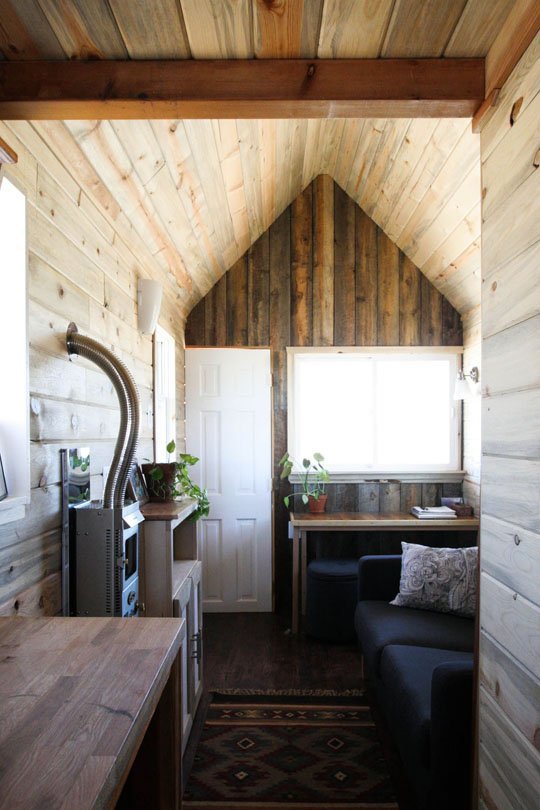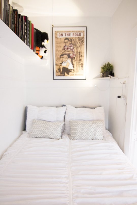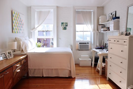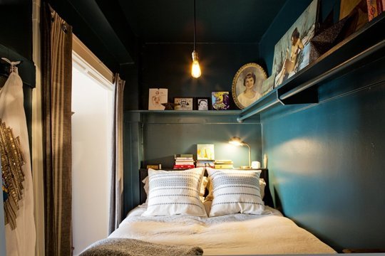
From studio apartments to tiny, odd-shaped bedrooms to every other small space in between, tiny homes require a gentle touch, lots of planning and a willingness to learn from your mistakes. And we’ve got eight you might be making in designing your small space. But don’t worry — we’ve also got suggestions on how to change!

1. Not thoughtfully customizing and maximizing the storage space you do have
We’re looking at you, vertical space, under-the-bed space, over-the-door space and more. We’re talking about lazy susans, tension rods, shelves above doors and other tricks of the organizing trade. It means taking inventory of the storage your home came with and figuring out how you can take it to the next level.
2. Using out-of-proportion furniture
This doesn’t necessarily mean only use extra-small furniture for extra small spaces. It means look to proportions to guide your design decisions. A big sectional that stretches from wall to wall, for instance, might look better in a tiny living room than an extra small love seat because small seating might accentuate the fact that the room is small, while a large sofa could make it feel cozy. Or, a petite square dining table might work better in a small dining room when it gives extra room to squeeze around it.

3. Having too much of everything
When space is at a minimum, you just can’t indulge your collecting urges and have a ton of anything, from pots and pans to art to furniture, paring down will start to become a pleasure when you see how much airier your space feels.
4. Not thinking it through
It pays to really sit down with a floor plan of your tiny space and some scale furniture to test layouts. Consider furniture that could pull double duty. Really experiment with different ideas to see which way space feels best for you. Your first furniture placement instincts might not be the best ones — and the best solution might not come to you without some thorough planning, first.
5. Breaking the space up too much
You want to be careful with layouts, room dividers, wall paint strategies and even rugs in small spaces — you could be visually breaking up your space into even smaller areas that are making the whole area feel cluttered and compartmentalized. Consider continuous, unbroken floor and wall surfaces if your space is feeling too tight.

6. Being afraid to go bold
We won’t deny it: Light colors do visually expand a space and make it seem a bit bigger than it maybe is. But we’ve spoken before about the dramatic effects dark wall colors and luxurious furnishings can have on a small space, too. As with many design ideas, the best practice for a small space is to commit to one design direction and really milk it.
7. Not using negative space to your advantage
In small spaces, it’s even more vital to give your eyes a break as it scans rooms full of your belongings. Don’t feel like you’ve got to fill every space up; not every wall needs art, not every sofa needs a coffee table.
8. Paying too much attention to numbered lists and not doing what your space needs
This is an important one! Every home is different, and what works in one won’t work in another. Tackle suggestions for improving small spaces intentionally: slowly, one at a time and with permission to change back if it doesn’t work.
What small space design mistakes have you made before and learned from? Share in the comments below.
Source: http://www.apartmenttherapy.com/